
Price chart overview
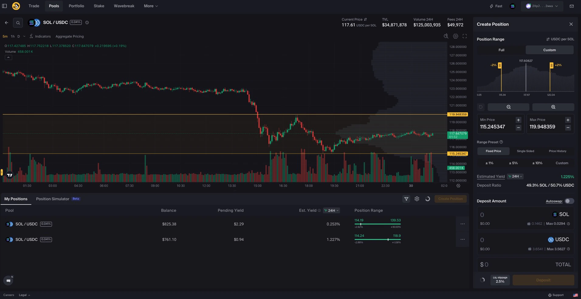
The Liquidity Terminal price chart includes tools for viewing and reviewing historical price movement. The horizontal axis represents time. The vertical axis represents price. At a glance, the chart lets you review how price has moved over the selected time period. The chart also includes tools for drawing, analysis, and customization. These tools can help you review historical price movement, mark reference points, and plan liquidity ranges. WhenCustom is selected in the Create Position sidebar, you can adjust your selected price range directly on the chart. See the Create a Custom Range how-to guide for a step-by-step walkthrough.
The price chart interface is divided into two main toolbars and two axis control panels:
Top toolbar overview
The top toolbar lets you configure how the price chart looks and behaves. This section moves left to right across the toolbar and outlines the key controls.Time interval
Select the time interval for each candlestick. Options range from minutes to days. For example, selecting a 15-minute interval means each candlestick represents 15 minutes of price activity.Indicators
Add technical indicators to help review price movement or volume. Selected indicators appear directly in the chart pane. Indicators are informational tools only. They do not predict future price movement or guarantee any trading or liquidity outcome.Chart settings
Customize the chart’s appearance and behavior. Click theSettings icon in the top right corner, or double-click a candlestick to open the configuration panel.
You can adjust visual styles, scale options, and other display settings.
Fullscreen mode
Switch to fullscreen for a focused chart view. This hides surrounding panels so you can view the chart with more space. The fullscreen toggle is located next to theSettings icon.
Left toolbar overview
The left toolbar provides access to drawing tools used for annotating the chart and marking reference points. You can:- Add trend lines, shapes, and markers
- Annotate price levels and ranges
- Measure historical movements
- Add comments or notes directly on the chart
Right control panel overview
You can scale the vertical axis manually by clicking and dragging. Hover over the axis to reveal additional options:- Select
Ato enable Auto mode, which fits visible data to the screen - Select
Lto switch to a logarithmic scale
Bottom panel: x-axis controls and further settings
You can scale the x-axis manually by clicking and dragging. To access additional options, click theSettings icon at the right end of the axis. This opens the price scale settings, where you can choose the scale mode, configure label visibility, and adjust other display preferences.
Each section is designed to provide quick access to chart tools without cluttering your workspace. You can interact with these elements directly or use keyboard shortcuts for faster navigation. Shortcuts are visible when you hover over components or open the relevant menus.
Support and feedback
Need support or want to share feedback?- Open a support ticket directly from the Orca UI by clicking
Support - Reach out on Discord or Telegram